Client
L'Adaptique
The Project
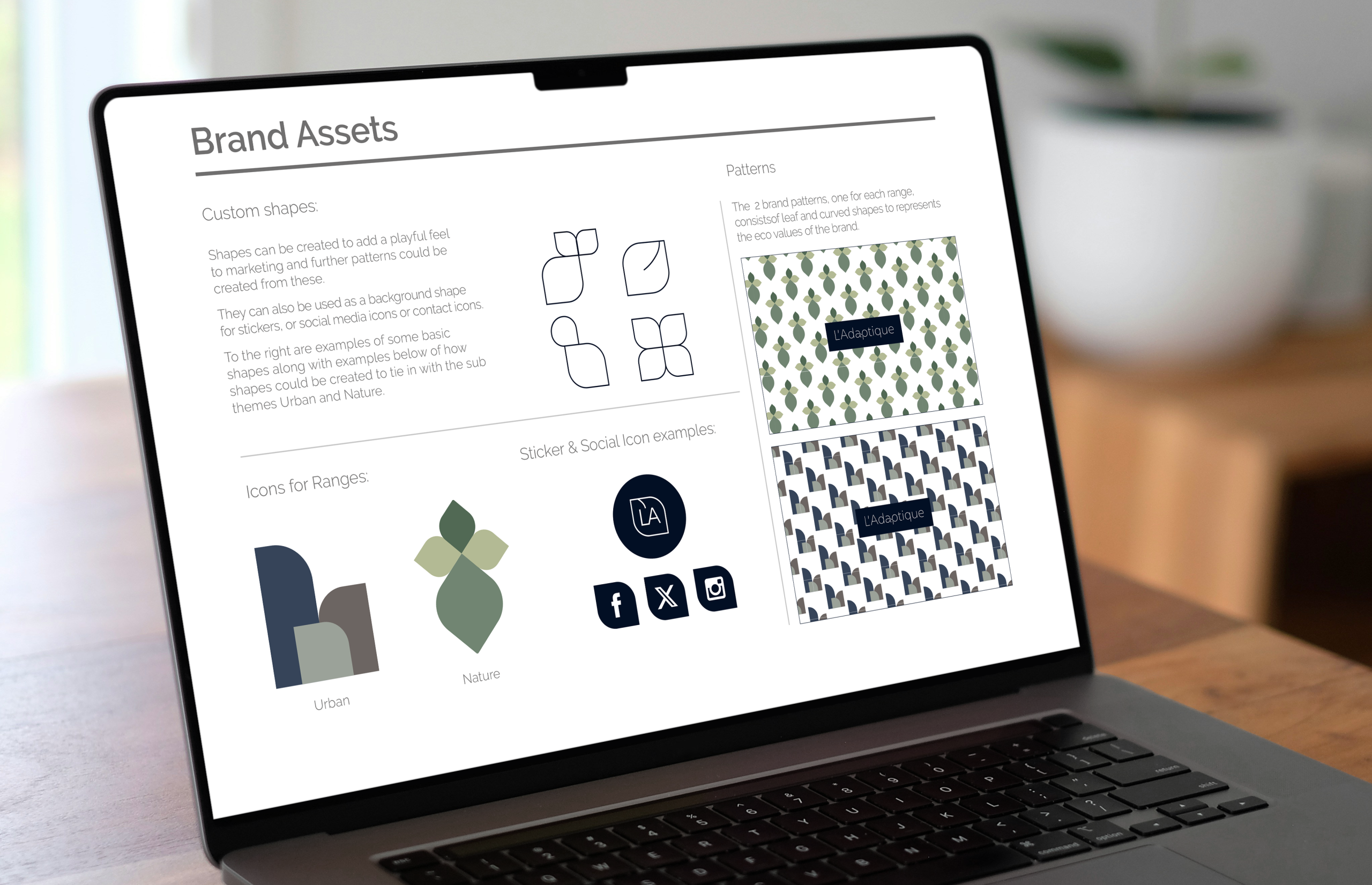
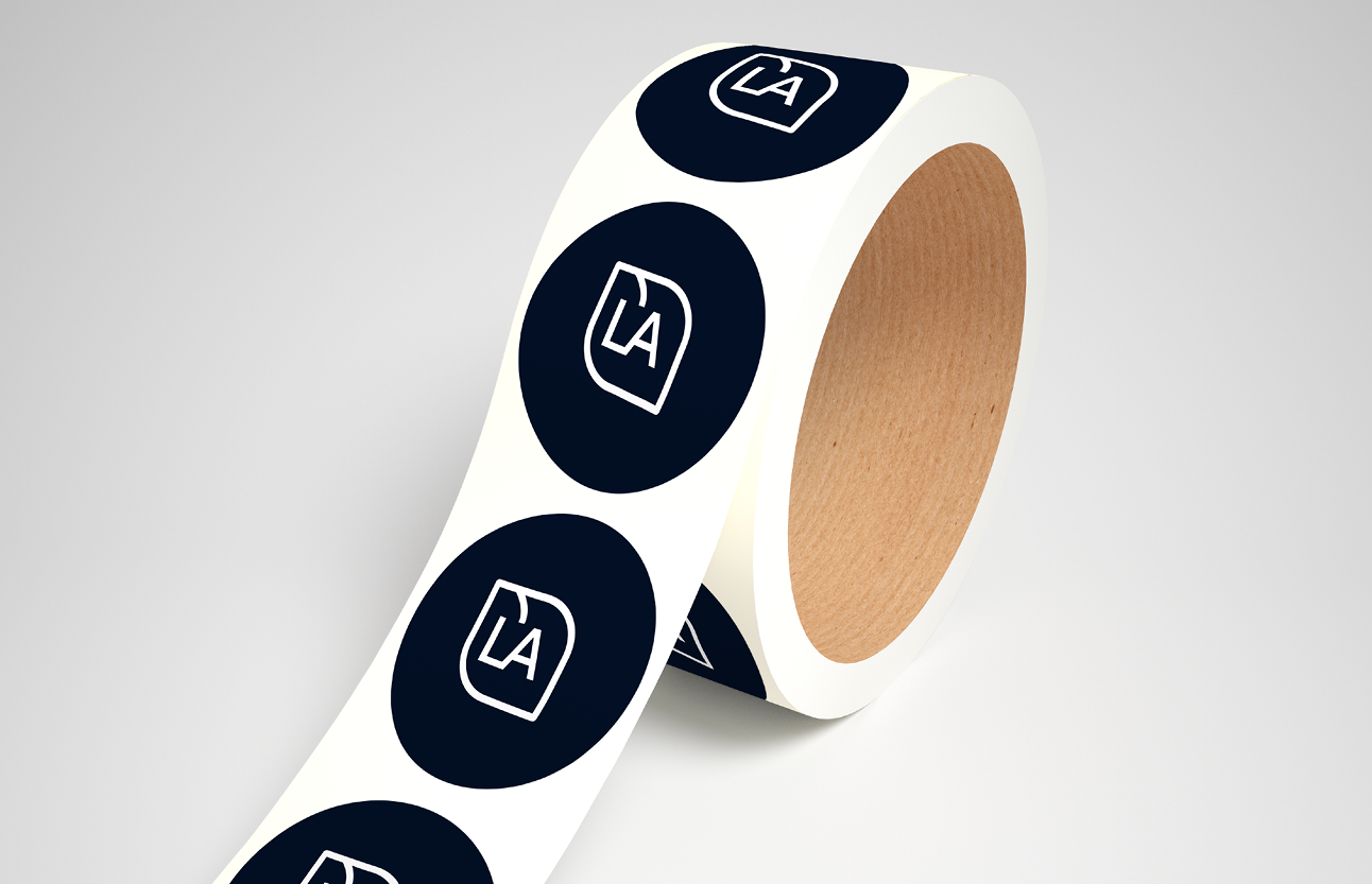
- Identity Design including logo, submark, icons, patterns, fonts and colour palette
The solution
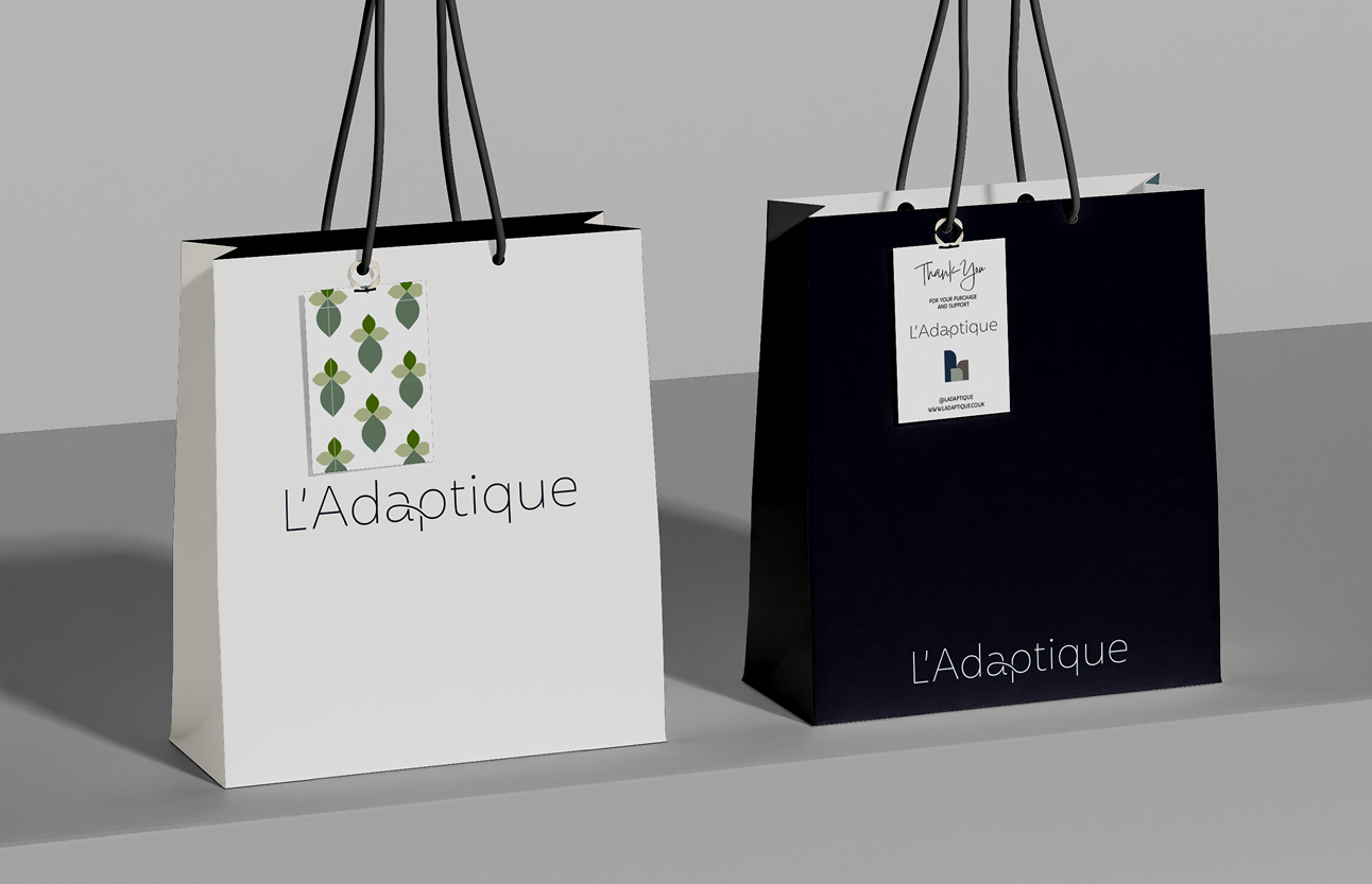
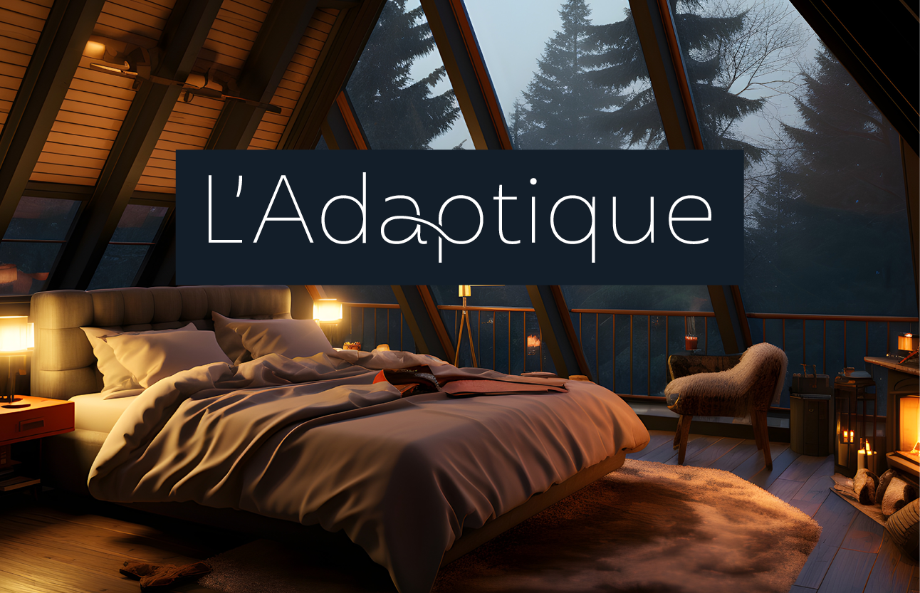
This was an evolution of the branding i’d already done for ISA & SAI. The client loved the original identity but for various reasons needed to change the business name. Therefore we kept as much of the initial branding as possible and tied it in with the new name.
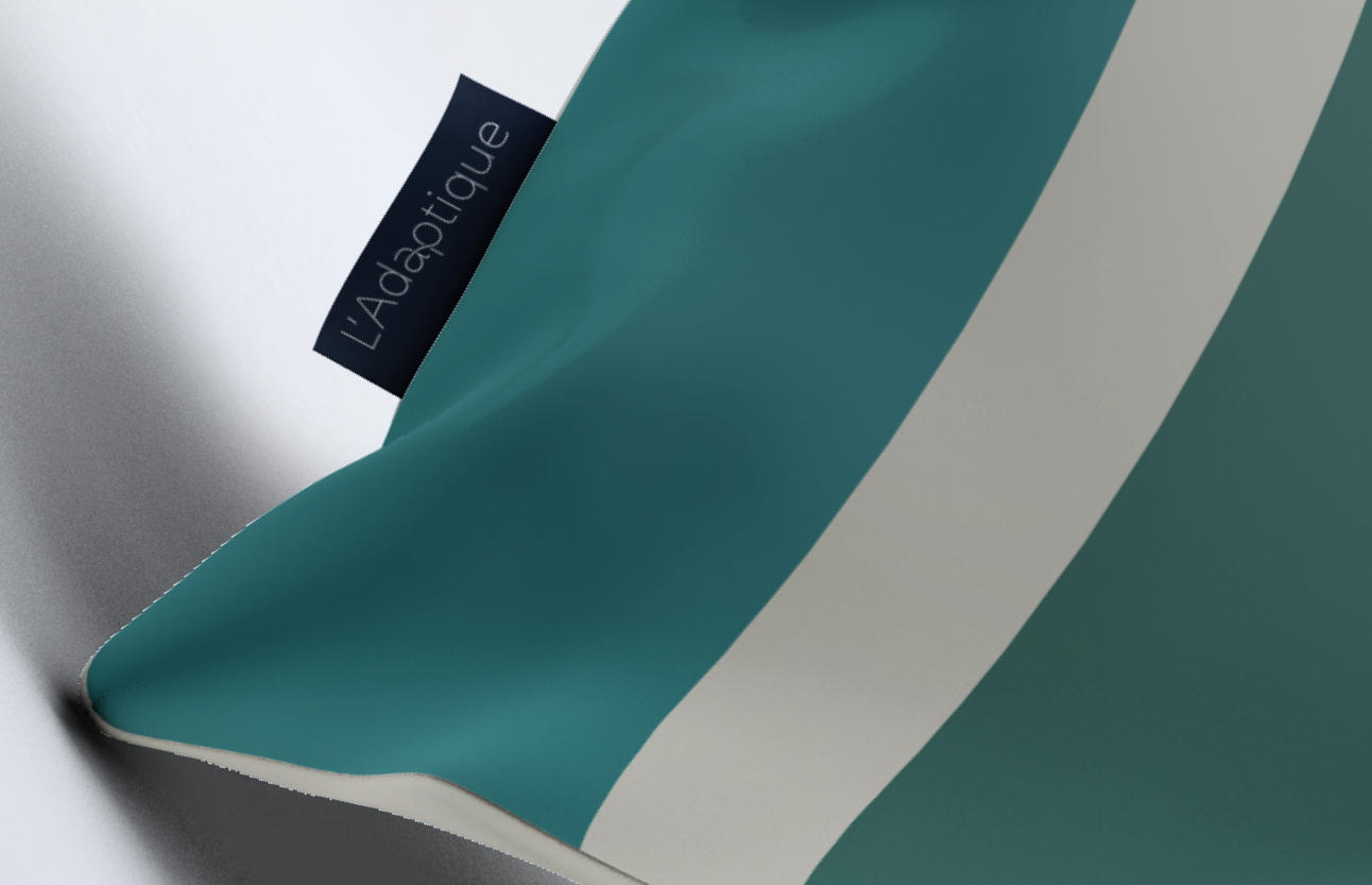
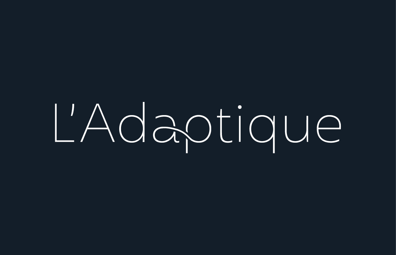
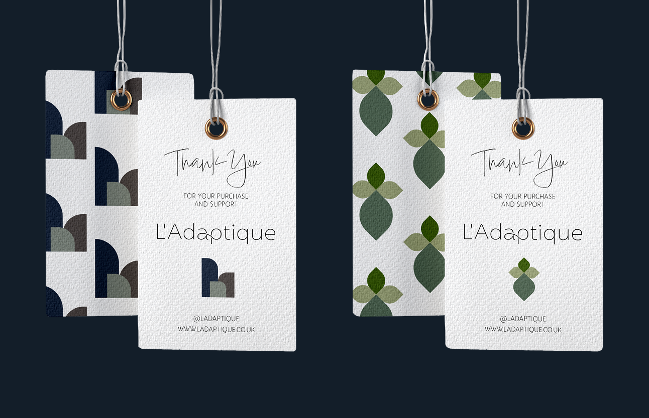
Using the original style I created another word mark logo but this time played on the a and p being interchangeable / adaptable and nodding to the infinity symbol to cement the eco credentials of the business. The secondary logo is placed in a leaf shape where the middle line of the leaf creates the apostrophe.
There will two ranges initially, Nature and Urban so some icons and patterns were developed for these using the leaf shape.